Resources
What is the recommended Podcast cover art size?
Having a podcast is a way to show the world you exist, and it’s a way to show the world how you think; because of that, podcasts have gotten more and more popular.
A podcast has so many aspects that you need to consider, from a unique theme to a regular release schedule.
But being just a good podcast is not enough; there are thousands of podcasts being released every day, and for you to get noticed, you need to do something extra other than just being good.
That’s where eye-catching podcast cover art and correct podcast cover art size comes in.
What is a Podcast Cover Art?
Podcast cover art is the image that shows up when someone searches for you.
It’s similar to your logo, and it’s the way people will recognize you. The podcast cover shows up on different platforms and helps you attract a new audience.
Why Do You Need a Podcast Cover Art?
As mentioned, the visually appealing cover art differentiates you and your podcast from thousands of other podcasts.
Also, podcast artwork shows the theme and genre of your podcast as well, so your audience knows what to expect from your show and how to feel when listening to your work.
On Apple iTunes, your cover art quality directly relates to your podcast appearing in the coveted “new and noteworthy” section. This will boost you and your viewer counts so much over the night, so no one wants to miss out on the chance to be featured on iTunes’ first page.
What Size Should Podcast Cover Art Be?
Like album cover art, podcast cover size varies from platform to platform.
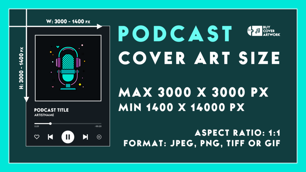
Some might recommend having 1800 x 1800 pixels, and others might recommend 2500 x 2500 pixels. But the usual recommended podcast cover art size is 3000 x 3000 pixels, with the minimum acceptable size being 1400 x 1400 pixels. Remember that no matter the size of your art, it should be a perfect square with an aspect ratio of 1:1. Also, the file’s format should be JPEG, PNG, GIF, or TIFF.
Most platform scale down your podcast cover size to 276 x 276 pixels, so keep in mind that your art should be visible and crystal clear even if it’s scaled down. If you don’t do that, your cover art won’t be recognized by new and potential audiences for your podcast.

How to Create Eye-Catching Podcast Cover Art?
There is no need to be a professional graphic designer if you want to design your Podcast covers.
These websites that are specialized in designing have pre-made formats that you can buy. They have lots of different fonts and colors, and if you see another cover art that you like, you can contact the designer and have them make one for you. Or, to make things even simpler, you can pay a professional designer to do the job for you, and you’ll get custom-made cover art just for you.
Buy Cover Artwork is one of them. You can use the pre-made designs or create something from the ground up yourself, and it’s entirely up to you to choose how you will make your cover art.
With our custom cover art design packages, You can even contact a professional designer to create your cover art for you; this way, you can save time working on your art and the content you put out while also having a professional-looking cover for your songs.
Best Practices for Creating Podcast Cover Design
Creating anything from scratch without proper training is more complicated than it should be, and podcast cover design is no exception. Having some set mindset and training before doing the job might help you significantly.
Visually Show What You’re All About
It would help if you showed what your podcast is about in one image.
It would be best if you told your audience about its genre and theme, the story behind it, and the story it’s trying to convey. You can use different fonts, colors, and backgrounds to achieve this goal. You can also use symbols you know people will recognize and see the character’s relation to your topic.
Don’t Get Too Wordy
For many reasons, having too many words on your cover is not the correct way to advertise.
For example, your words might not be understandable when the picture is scaled down. Using as few as humanly possible words is better than using words for your cover so your viewer can appreciate the art for what it is.
But remember, this is just a suggestion and not an absolute, and there are podcasts with lots of words on their cover art doing better than just well. So, you’ll need to figure out how you will approach this.
Avoid Using Overused Images
Using an overused image might make an unwanted duplicate from an existing cover art and create undesired confusion.
This will automatically make your audience turn their head away, mistaking you for someone else or the other way around.
Be Consistent with Branding
Being consistent is an essential part of making a brand.
It helps people recognize you everywhere they see you and your brand. Your audience will relate specific fonts and colors to your brand; if you suddenly change them, it will heart your branding.
Being consistent helps with connecting with your fans, with them showing their love for you using the colors and fonts you’ve chosen for your brand.
Let Typography Do the Talking
Typography is an art form that deals with the arrangement of your text in your picture.
It helps gives more meaning and character to your podcast and gives the order to your art. It also matters what fonts you need to use to provoke different reactions from a possible fan.
Use Color Contrast to Your Advantage
Color is one of your most vital tools to use.
It helps a lot with first impressions. So make sure not just to use any color; it might have an unintentional meaning behind it and a completely different effect than what you wanted from it.
Over to You
You might overlook podcast cover art, thinking it’s nothing significant and you can fix it in 2 or 3 hours, but good cover art is one that you put time and effort into, and it shows how different it is from just any other cover art.


🎙